


A RENAULUTION FOR THE ICONIC DIAMOND LOGO.
A RENAULUTION FOR THE ICONIC DIAMOND LOGO.
- Revealed at the Renaulution event earlier this year, the new logo symbolises Renault’s move into a new era
- Reflecting the brand’s heritage, the logo is uncluttered with no signature or typography
- Gilles Vidal, Renault Design Director, talks through the design of the new logo and how it’s evolved
- By 2024, the entire Renault model range will carry the redesigned emblem
- Watch Gilles Vidal discuss the vision behind the new logo in the full video here
The geometric shape of the iconic Renault diamond has embodied the brand since 1925 and has become instantly recognisable. Now, the diamond is about to help the brand continue looking forward as it moves into a new era, and Gilles Vidal, Renault Design Director, reveals how and why this new logo came into being.
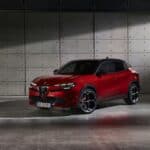
First unveiled at the Renaulution event in January, the new Renault diamond was proudly displayed behind Luca de Meo, CEO Groupe Renault, as well as pride of place on the new Renault 5 Prototype. The roll-out since then has been gradual, subtle, but effective, firstly with the New ZOE advertising campaign, and then across Renault’s social media channels.
Gilles Vidal, Renault Design Director, said: “The diamond is one of the most recognised shapes in the world, and in the world of the automobile. It is a simple geometric shape, with a strong, powerful identity. The challenge was to renew this shape by giving it meaning, along with new, contemporary values to project the brand into the future.
A new logo for a new era;
Over the course of its history, Renault has changed its visual identity several times. One thing that hasn’t changed since 1925 is the diamond shape that serves as the base for the logo – an iconic emblem of the brand. The angled, geometric shape inspired Louis Renault, and it was adapted to the angled bonnets of the time. Since then, the diamond has been redesigned nine times, including this latest revision.
The current logo – created in 1992 and redesigned in 2015 – is being redesigned as Renault moves into a new era to meet the challenges of a modern international brand, with a significant focus on the digital world.
“It is a balance between recognition of the brand’s heritage and entering a new era, symbol of the future”, as Gilles Vidal explains that the recently revealed logo is more vibrant and modern. “The restyled diamond perfectly embodies the ‘New Wave’ era that Renault has entered” continues Gilles Vidal.
It was therefore naturally unveiled during the presentation of the Renaulution strategic plan and integrated on the grille of the Renault 5 Prototype and, following the praise for both the model and badge, it was officially launched as the new logo.
“We have integrated it on the Renault 5 Prototype for the first time. It was for us a formidable testing ground. In view of the enthusiasm and the very positive feedback we received about the logo, we decided to launch it,” said Gilles Vidal.
An even more iconic diamond;
The diamond embodies Renault, and it needed to be preserved. “We have rethought it to become more iconic, simple and meaningful, a true timeless signature, without superfluous effects or colours, with a contemporary takeover of the lines, an essential part of our graphic heritage,” Gilles Vidal explains.
Uncluttered, with no signature or typography, this new logo has been designed to deliver movement. The flat treatment enables its animation, for example on video or digital media, but also on vehicles, for their welcome sequence.
This new logo will be gradually applied to Renault vehicles. “By 2024, the entire Renault range will carry this new emblem,” concludes Gilles Vidal.
Images here